 English
 Nederlands
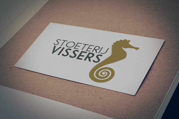
Stoeterij Vissers
Wim Vissers is the owner of Stoeterij Vissers. His breeding unit has about 13 broodmares and, each year, there are just as many talented sports foals born on his yard in Gemert, Brabant. The breeder is known for crossing the best international bloodlines.
Stoeterij Vissers wanted a new logo and a new corporate identity. We designed one for them, most notably the logo. A stud farm means horses. Vissers refers to the sea. (Transl. Visser = fisherman in Dutch). A seahorse is therefore the perfect icon for Stoeterij Vissers. It is an elegant and intelligent animal. Green radiates peace and strength and symbolises the fields in which foals grow up. The seahorse stands apart from the text as the foals bred at Stoeterij Vissers eventually leave the yard. This powerful logo remains recognisable even when it is printed small.
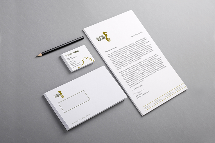
The business card, letterhead and envelope were also designed by us.