 English
 Nederlands
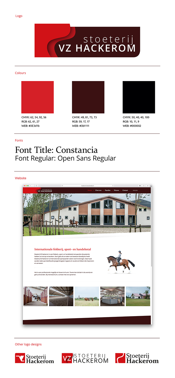
Logo Stoeterij VZ Hackerom
The name of the equestrian company indicates that owner Antoon attaches great importance to the street names where his company is located. VZ stands for Vogelenzang. This is the street name where he founded his construction company in 1968. Hackerom is the street name where the newly established company is located.
Therefore, there has been chosen to reference to one of these streets in the design. We chose for Hackerom since it is the new location. When we look at the street on the map we see a clear line. This line is then stylized in a way that it creates a unique and elegant form. A recognizable form that emphasizes the elegance of dressage sports. The name ‘stud farm’ already indicates that it is an equestrian company and there is no need to refer to a horse in the logo in another way.
The colors red and black are chosen because of the logo of Bouwbedrijf Koenen. This creates a clear link between the two logos of Antoon’s two companies.
The design takes into account the fact that this logo will have to be applied in the equestrian sector. Taking into account embroidery on saddle covers etcetera. It is also a recognizable logo in a small format (favicon in url-bar).